Peep into basics of Data Visualization
Seaborn is a visualization library that sits on top of matplotlib. Seaborn offers enhanced features compared to matplotlib.
Seaborn is a library for making statistical graphics in Python. It builds on top of matplotlib and integrates closely with pandas data structures.
Seaborn helps you explore and understand your data. Its plotting functions operate on dataframes and arrays containing whole datasets and internally perform the necessary semantic mapping and statistical aggregation to produce informative plots. Its dataset-oriented, declarative API lets you focus on what the different elements of your plots mean, rather than on the details of how to draw them.
For more examples see this https://seaborn.pydata.org/examples/index.html
# import libraries
import pandas as pd # Import Pandas for data manipulation using dataframes
import numpy as np # Import Numpy for data statistical analysis
import matplotlib.pyplot as plt # Import matplotlib for data visualisation
import seaborn as sns # Statistical data visualization
To learn more about seaborn, let us learn with examples. Consider breast cancer dataset.
# Import Cancer data drom the Sklearn library
from sklearn.datasets import load_breast_cancer
cancer = load_breast_cancer()
cancer['feature_names']
array(['mean radius', 'mean texture', 'mean perimeter', 'mean area',
       'mean smoothness', 'mean compactness', 'mean concavity',
       'mean concave points', 'mean symmetry', 'mean fractal dimension',
       'radius error', 'texture error', 'perimeter error', 'area error',
       'smoothness error', 'compactness error', 'concavity error',
       'concave points error', 'symmetry error',
       'fractal dimension error', 'worst radius', 'worst texture',
       'worst perimeter', 'worst area', 'worst smoothness',
       'worst compactness', 'worst concavity', 'worst concave points',
       'worst symmetry', 'worst fractal dimension'], dtype='<U23')
np.C_ class object translates slice objects to concatenation along the second axis.
Create a dataFrame named df_cancer with input/output data
df_cancer = pd.DataFrame(np.c_[cancer['data'], cancer['target']], columns = np.append(cancer['feature_names'], ['target']))
#  head of the dataframe
df_cancer.head()
| mean radius | mean texture | mean perimeter | mean area | mean smoothness | mean compactness | mean concavity | mean concave points | mean symmetry | mean fractal dimension | radius error | texture error | perimeter error | area error | smoothness error | compactness error | concavity error | concave points error | symmetry error | fractal dimension error | worst radius | worst texture | worst perimeter | worst area | worst smoothness | worst compactness | worst concavity | worst concave points | worst symmetry | worst fractal dimension | target | |
|---|---|---|---|---|---|---|---|---|---|---|---|---|---|---|---|---|---|---|---|---|---|---|---|---|---|---|---|---|---|---|---|
| 0 | 17.99 | 10.38 | 122.80 | 1001.0 | 0.11840 | 0.27760 | 0.3001 | 0.14710 | 0.2419 | 0.07871 | 1.0950 | 0.9053 | 8.589 | 153.40 | 0.006399 | 0.04904 | 0.05373 | 0.01587 | 0.03003 | 0.006193 | 25.38 | 17.33 | 184.60 | 2019.0 | 0.1622 | 0.6656 | 0.7119 | 0.2654 | 0.4601 | 0.11890 | 0.0 |
| 1 | 20.57 | 17.77 | 132.90 | 1326.0 | 0.08474 | 0.07864 | 0.0869 | 0.07017 | 0.1812 | 0.05667 | 0.5435 | 0.7339 | 3.398 | 74.08 | 0.005225 | 0.01308 | 0.01860 | 0.01340 | 0.01389 | 0.003532 | 24.99 | 23.41 | 158.80 | 1956.0 | 0.1238 | 0.1866 | 0.2416 | 0.1860 | 0.2750 | 0.08902 | 0.0 |
| 2 | 19.69 | 21.25 | 130.00 | 1203.0 | 0.10960 | 0.15990 | 0.1974 | 0.12790 | 0.2069 | 0.05999 | 0.7456 | 0.7869 | 4.585 | 94.03 | 0.006150 | 0.04006 | 0.03832 | 0.02058 | 0.02250 | 0.004571 | 23.57 | 25.53 | 152.50 | 1709.0 | 0.1444 | 0.4245 | 0.4504 | 0.2430 | 0.3613 | 0.08758 | 0.0 |
| 3 | 11.42 | 20.38 | 77.58 | 386.1 | 0.14250 | 0.28390 | 0.2414 | 0.10520 | 0.2597 | 0.09744 | 0.4956 | 1.1560 | 3.445 | 27.23 | 0.009110 | 0.07458 | 0.05661 | 0.01867 | 0.05963 | 0.009208 | 14.91 | 26.50 | 98.87 | 567.7 | 0.2098 | 0.8663 | 0.6869 | 0.2575 | 0.6638 | 0.17300 | 0.0 |
| 4 | 20.29 | 14.34 | 135.10 | 1297.0 | 0.10030 | 0.13280 | 0.1980 | 0.10430 | 0.1809 | 0.05883 | 0.7572 | 0.7813 | 5.438 | 94.44 | 0.011490 | 0.02461 | 0.05688 | 0.01885 | 0.01756 | 0.005115 | 22.54 | 16.67 | 152.20 | 1575.0 | 0.1374 | 0.2050 | 0.4000 | 0.1625 | 0.2364 | 0.07678 | 0.0 |
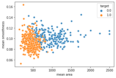
Let us see how to draw scatter plot.
Scatter plots are extremely useful to analyze the relationship between two quantitative variables in a data set. Often datasets contain multiple quantitative and categorical variables and may be interested in relationship between two quantitative variables with respect to a third categorical variable. And coloring scatter plots by the group/categorical variable will greatly enhance the scatter plot.
The relationship between x and y can be shown for different subsets of the data using the hue.
The default treatment of the hue, if present, depends on whether the variable is inferred to represent “numeric” or “categorical” data. In particular, numeric variables are represented with a sequential colormap by default, and the legend entries show regular “ticks” with values that may or may not exist in the data.
# Plot scatter plot between mean area and mean smoothness
# hue is target.
sns.scatterplot(x = 'mean area', y = 'mean smoothness', hue = 'target', data = df_cancer)
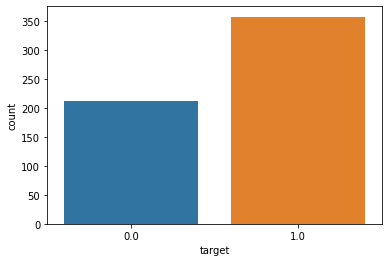
# Let's print out countplot to know how many samples belong to class #0 and #1
sns.countplot(df_cancer['target'], label = "Count")
seaborn.pairplot()
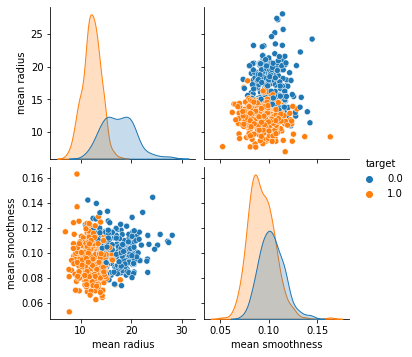
To plot multiple pairwise bivariate distributions in a dataset, you can use the pairplot() function. This shows the relationship for (n, 2) combination of variable in a DataFrame as a matrix of plots and the diagonal plots are the univariate plots.
Plot pairwise relationships in a dataset.
By default, this function will create a grid of Axes such that each numeric variable in data will by shared across the y-axes across a single row and the x-axes across a single column. The diagonal plots are treated differently: a univariate distribution plot is drawn to show the marginal distribution of the data in each column.
It is also possible to show a subset of variables or plot different variables on the rows and columns
# Plot the pairplot
sns.pairplot(df_cancer, hue = 'target', vars = ['mean radius', 'mean smoothness'] )
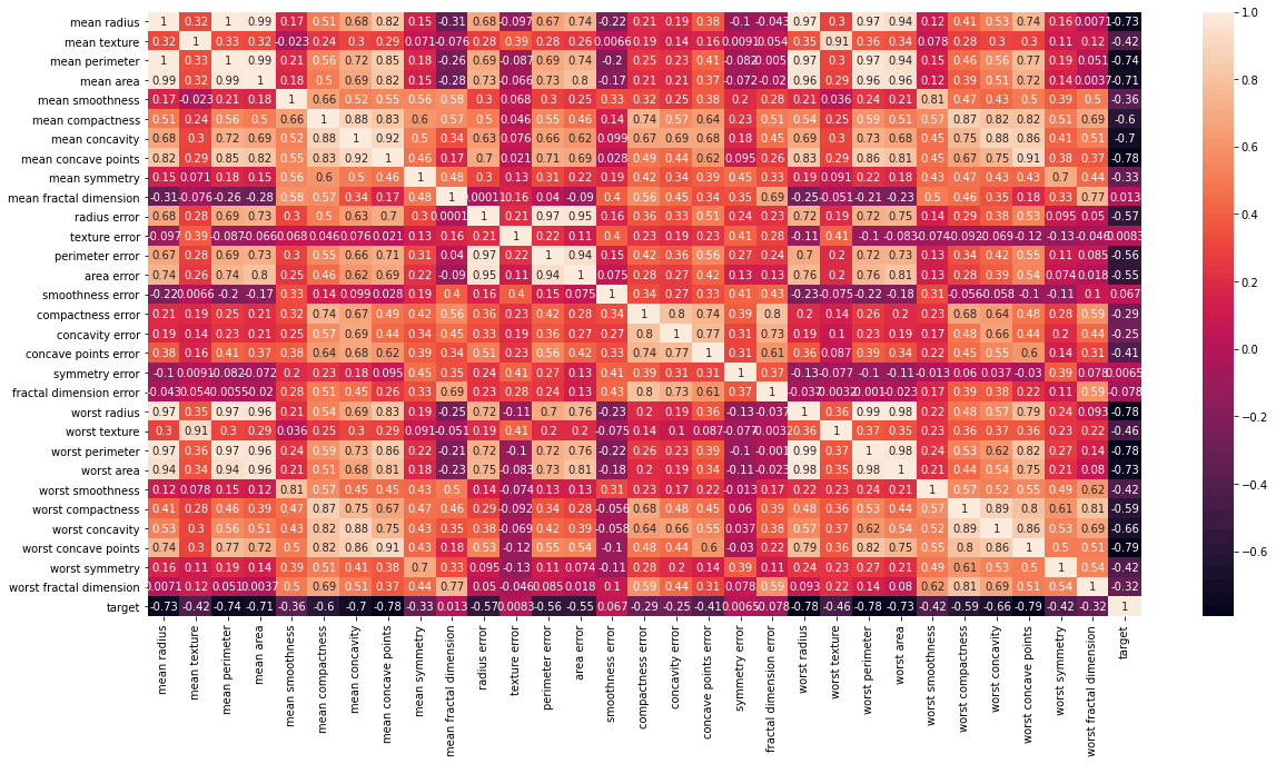
Heatmap
Heatmap is defined as a graphical representation of data using colors to visualize the value of the matrix. In this, to represent more common values or higher activities brighter colors basically reddish colors are used and to represent less common or activity values, darker colors are preferred. Heatmap is also defined by the name of the shading matrix. Heatmaps in Seaborn can be plotted by using the seaborn.heatmap() function.
# Strong correlation between the mean radius and mean perimeter, mean area and mean primeter
plt.figure(figsize = (20, 10))
sns.heatmap(df_cancer.corr(), annot = True)
Distplot
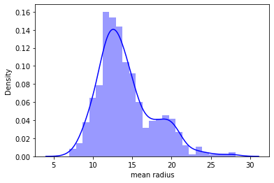
It is used basically for univariant set of observations and visualizes it through a histogram i.e. only one observation and hence we choose one particular column of the dataset.
# plot the distplot
# Displot combines matplotlib histogram function with kdeplot() (Kernel density estimate)
# KDE is used to plot the Probability Density of a continuous variable.

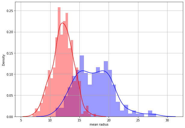
sns.distplot(df_cancer['mean radius'], bins = 25, color = 'blue')
#Plot two separate distplot for each target class #0 and target class #1**
class_0_df = df_cancer[ df_cancer['target']==0 ]
class_1_df = df_cancer[ df_cancer['target']==1 ]
# Plot the distplot for both classes
plt.figure(figsize=(10, 7))
sns.distplot(class_0_df['mean radius'], bins = 25, color = 'blue')
sns.distplot(class_1_df['mean radius'], bins = 25, color = 'red')
plt.grid()
